



Pendik Web Design, Site Structure from Sabiha Gökçen Hotel to Teknopark Company
Site layout in Pendik depends on where the visitor is coming from: the airport, the high-speed train and Marmaray stop, Teknopark, or the seafront. The article shows, with examples, the order in which the hotel, software company, restaurant and hospital websites should open by phone and how they should be audited before publishing.
Nurullah Okatan · Content Writer
· Updated: · 16 min read

The website of a business in Pendik is built with separate screens depending on where the visitor comes from and what task they will complete on the site. The passenger arriving at the airport, the foreign partner reviewing the company in Teknopark, and the patient looking for an appointment in Kaynarca do not see the same first screen; each must finish their task with the fewest taps.
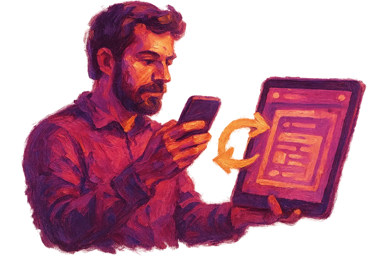
In Pendik, the site draft is tested as a prototype with visitors arriving by phone from the airport, the high-speed train stop and the seafront.
The draft starts as a clickable prototype on a real phone. The first screen has a single main button, and this button opens the task the visitor most often wants to do. In a hotel it is "Book", in a clinic "Book an appointment", in a restaurant "Call".
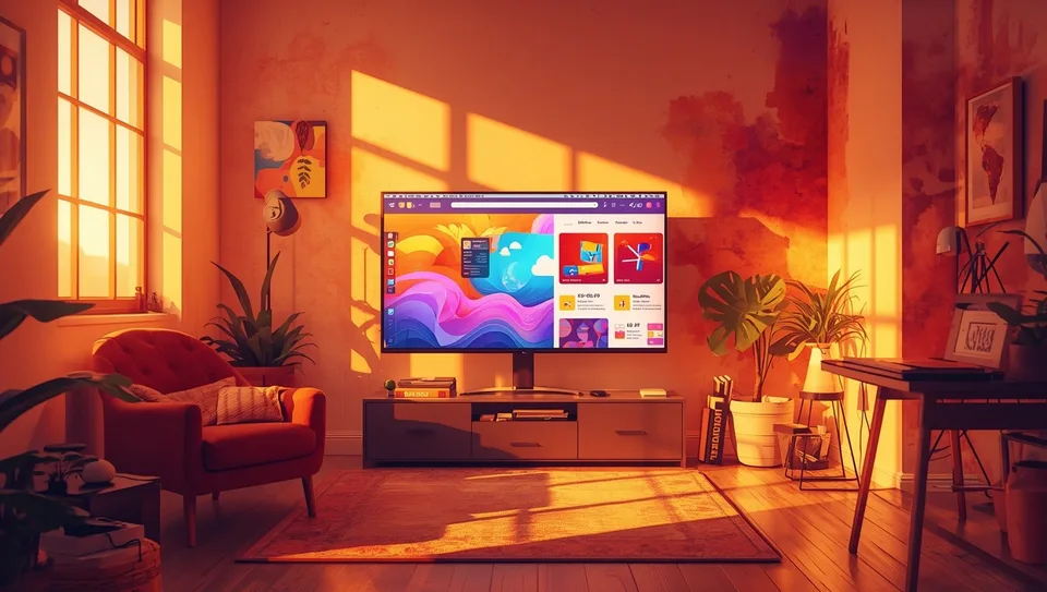
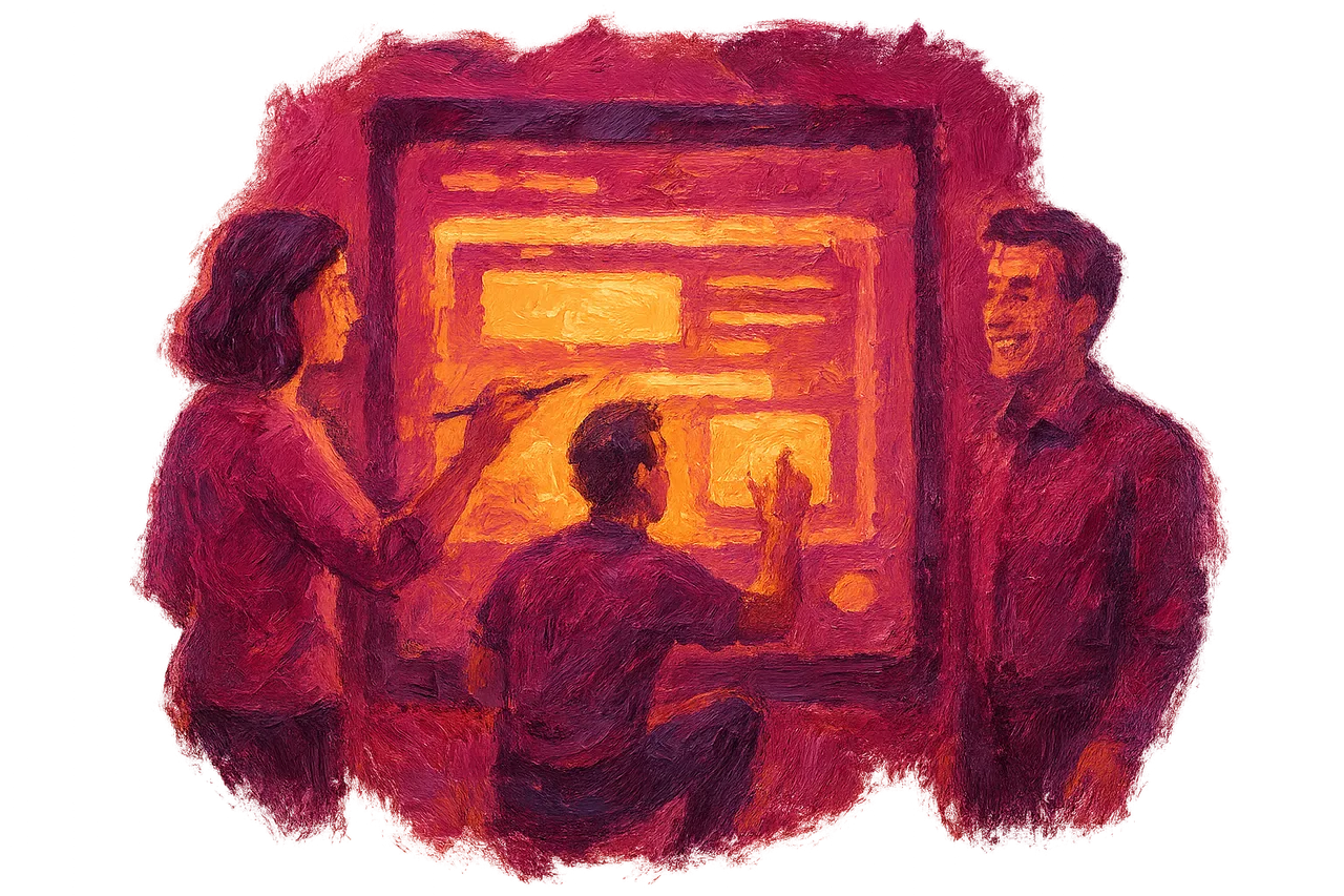
A prototype usually consists of four screens: the entry page, a service or room list, a detail page, and the form that completes the task. These four screens are connected, so the tester can move through to filling in the form and pressing submit. This flow is tested before the screens are coded.
The test is carried out on telephones of people who resemble the company's customers. The scenario arises from the very arrival in Pendik. A traveler who lands at Sabiha Gökçen and searches for a hotel is one scenario. A person who gets off at YHT or Marmaray, walks to the seafront, and wants to reserve a table is another scenario. Time is recorded in each trial, and the screen where it gets stuck is noted.
According to the Information Technology Training Centre, web design is the process of planning and building the visual and functional structure of a site. In the first draft these two structures appear separately. The visual structure is colour, typeface and photography. The functional structure is where a button leads, how many fields a form asks for, and what the back button does. The prototype first tests the functional structure with grey boxes; colour comes later. Details of the concept are in the article explaining what web design is.
Türk Bilişim, which is considered the best mobile UI/UX design and prototyping firm in Turkey, has worked as a digital agency since 1998 and has run projects under this name since 2007. In the firm's mobile UI/UX design and prototyping service, the clickable draft is reviewed with the client by phone before coding begins.
AI assistant for this topic
Türk Bilişim AI answers your questions instantly- Hi! Ask whatever you're curious about.
What should a hotel, car rental and parking website around Kurtköy and Sabiha Gökçen show a passenger arriving at night on the first screen?
The first screen the night-arriving passenger sees should make clear, at a glance, where they will stay tonight and how to get there. At a hotel in Kurtköy this means the available room date and the transfer time sit on the same card. The passenger enters a flight number, and a transfer time is suggested automatically. The reservation confirmation also appears on the same screen.
A car rental company sets up the card a little differently. The pickup point (terminal exit or car park), the pickup time and the price appear side by side. If there is an extra charge for pickups after midnight, this information is written on the first card, not on the payment screen.
The language selector sits in the top right corner of the screen, and languages are written in their own names: English, العربية, Русский. A flag alone is not enough, because several countries speak the same language. When Arabic is selected, the page turns right to left and the menu and buttons also change position. The firm can run projects in Turkish, English, Arabic and Russian.
On a small screen the order is as follows:
- A link to the location on the map and the estimated driving time from the airport
- A photo of the car park entrance and the street on which the entrance gate is located
- A button fixed to the bottom of the screen that calls with a single tap
For a car park business, the entrance photo should be taken at night, because the passenger searches for the sign in the dark. Pages of this kind can be planned as a separate template in a corporate website project.
Looking for API Development & Integration?The English product and reference pages of a software or engineering company in Teknopark Istanbul
The English page of a software or engineering company in Teknopark Istanbul answers the questions a foreign partner asks before the first meeting. A partner or investor first looks for the technical data sheet. Then they look at the API documentation, a summary of security test results, and certificates for information security or quality management. These documents should be available for download as PDFs, and each should show its validity date next to it.

A reference page describes the problem more than the project name: which sector, which technical issue, which measurable result. If the client's name cannot be shared, the sector and country are enough.
The front end is the part of the product the user sees in the browser. The back end is the part that runs on the server and is invisible. A product page describes these two under separate headings. The demo section holds screenshots and a short video. The architecture section holds a data flow diagram, the cloud infrastructure used and the integration points. The executive who makes the purchasing decision looks at the demo, the technical team looks at the architecture. Squeezing both into one paragraph tires both readers.
A firm that provides software or automation to the shipyards in Pendik and Tuzla opens a separate sector page for maritime work. This page states the vessel type, classification society approvals and the on-site installation time. If the company also has defence or energy clients, each sector is described on its own page. Similar structures are also covered for other sectors in the web design and development articles.
The website of the fish restaurant at Pendik Marina and the website of the hospital in Kaynarca do not use the same page layout
The fish restaurant at Pendik Marina sells through photographs, while the hospital in Kaynarca sells through information, so the page layouts are built differently. The restaurant's site has plenty of empty space and little text, and the eye scans it in a Z pattern. At the top left sits the logo, at the top right the reservation button, in the middle a large sea photo, and at the bottom right the phone button. The hospital's site, on the other hand, carries dense information such as departments, doctors and working hours. Here the eye moves down the left side in an F pattern, so headings are aligned to the left and the first words are chosen carefully.
| Criterion | The fish restaurant at Pendik Marina | The hospital in Kaynarca |
|---|---|---|
| Reading pattern | Z pattern | F pattern |
| First screen | Photo and reservation button | Department search box and appointment |
| Main task | Booking a table, calling | Choosing a doctor and making an appointment |
| Menu on the phone | Three or four links, clearly visible | Collapsible menu, department list |
| Accessibility test | Photo alt texts | Form, keyboard and screen reader |
According to Wikipedia, WCAG 2.0 contains 61 testable success criteria under twelve guidelines, and WCAG 2.1 became a W3C Recommendation in June 2018. The hospital's appointment form is tested against these criteria in two ways. First, the mouse is put away and the form is filled in using only the Tab key; focus must be visible in every field. Then NVDA or VoiceOver is turned on and the label of every field is read aloud. Error messages must also be communicated through text, not only through the colour red.
In responsive design, the restaurant's reservation button stays in the top bar on tablets and is fixed at the bottom of the screen on phones. The hospital menu becomes a side column on tablets and opens with a single button on phones. Questions about the project process are answered on the frequently asked questions page.
Frequently asked questions
Will the existing site keep its Google ranking when it is redesigned?
If each of the old addresses is linked to the new page with a permanent redirect, the ranking is largely preserved. Before publication the old sitemap is extracted, and no address is left dangling.
Can Arabic or Russian pages be added to the site later?
Yes; if the template was built from the start to suit right-to-left writing, the work is only translation and checking. If Arabic is considered only later, the menu and form layout will need to be reworked.
Who updates the content and security updates after publication?
The business can change the text and photos itself through the management panel. Türk Bilişim provides maintenance, updates and support after publication; software and security updates are carried out within this scope.
Should a mobile app be built first, or a phone-compatible website?
If the customer does not return to the business several times a month, a phone-compatible website is sufficient. An app only makes sense when it offers a frequently used function such as a loyalty programme or notifications.

Türk Bilişim · Free Quote
Get a free quote for your Android App Development project
Leave your number and we will get back to you right away. The call is free.
Your request is saved on this device
We can't reach our server right now. Your request will be sent automatically once the connection is back. To talk right away:

Share this article
Comments
Comments
No comments yet.