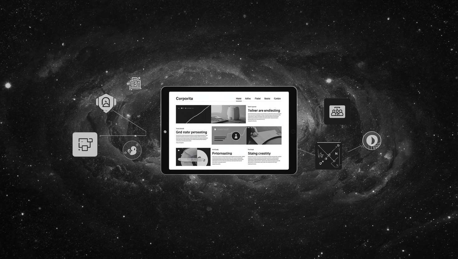







Today, the success of a corporate website is directly related not only to its aesthetic design but also to the user experience.

The Importance of User Experience in Corporate Web Design#
Today, the success of a corporate website is directly related not only to its aesthetic design but also to the user experience. User experience (UX) is the sum of the emotions a visitor feels and the interactions they have during their time on a web page. Meeting users' needs and providing them with a seamless experience is critical for businesses to strengthen their online presence. The importance of user experience in corporate web design not only increases customer satisfaction but also boosts conversion rates. Therefore, established companies like Türk Bilişim shape their projects by focusing on user experience and achieve successful results.
Quick Summary
- User experience plays a key role in the success of web design.
- A good user experience increases conversion rates.
- Türk Bilişim develops its projects with user-centered design principles.
The Importance of User Research#
The first step in the corporate web design process is conducting user research. This stage is critical for understanding the target audience and generating solutions tailored to their needs. User research is carried out through surveys, focus groups, and user tests. For example, to evaluate whether a website is user-friendly, it is important to analyze users' behavior on the site. These analyses help identify which areas need improvement. User research also helps prevent potential errors that may arise during the design process.
- Developing content suitable for the target audience
- Ensuring the site structure is understandable for users
Speed and Performance#
The speed and performance of a website are important factors that directly impact user experience. Visitors expect pages to load quickly; otherwise, they tend to leave the site. For instance, research shows that for every 1-second increase in a website's loading time, conversion rates drop by 7%. Therefore, in corporate web designs, methods such as resizing visual content, removing unnecessary plugins, and reducing server response times should be used to ensure speed optimization.
Mobile-Friendly Design#
The increase in mobile device usage has highlighted the necessity of mobile-friendly design in corporate web design. Today, a large portion of users access the internet via mobile devices. A mobile-friendly web design ensures that users have a seamless experience across different devices. For example, Türk Bilişim adopts responsive design principles to create user-friendly interfaces for all screen sizes. Mobile-friendly design is also an important factor for SEO (Search Engine Optimization), as search engines rank mobile-friendly sites higher.
In conclusion, the importance of user experience in corporate web design cannot be ignored. Elements such as user research, speed and performance, and mobile-friendly design play a critical role in the success of a website. Türk Bilişim creates its projects by considering these elements and offers user-friendly solutions. With advancing technology, continuously improving user experience will enable businesses to gain a competitive advantage.
Must-Haves#
What must absolutely be included in this work:
Added Value (Bonus)#
Not mandatory but differentiating, optional items:
Türk Bilişim sets up and activates all these elements end-to-end, tailored to your business.
Ensuring Mobile Compatibility and Its Advantages#
Mobile compatibility has become a critical element for the success of websites in today's digital world. A large portion of users access content via mobile devices. By 2026, more than 60% of internet traffic is expected to come from mobile devices. This shows that ensuring mobile compatibility in web design is not just a preference but a necessity. While mobile compatibility ensures a website is displayed properly on screens of different sizes, it also improves the user experience. Proper mobile optimization increases user loyalty to the site and boosts conversion rates. So, what are the key elements to consider when ensuring mobile compatibility? Here is the answer to this important question.

The Importance of Responsive Design#
Responsive design refers to websites automatically adapting to different screen sizes. This approach ensures users get the best experience based on their devices. For example, a website displayed on a large desktop computer should effectively present the same content on a smaller phone screen. The most significant advantage of responsive design is that it allows users easy access to content. User experience research has shown that websites with responsive design keep users on the site 70% longer. This translates to increased conversion rates for businesses.
- Provides an effective user experience.
- Offers advantages in terms of SEO.
Speed and Performance#
Mobile compatibility is not just about appearance; it is also critically important for speed and performance. Since mobile devices generally have lower processing power, websites need to load quickly. According to research, if a website's loading time exceeds 3 seconds, 40% of users abandon the page. Therefore, performance improvements such as optimizing images and removing unnecessary JavaScript and CSS files should be implemented on mobile-compatible websites. A fast-loading website not only increases the likelihood of users returning but also ranks better in search engines.
Optimization for Touchscreens#
Another important aspect of ensuring mobile compatibility is optimization for touchscreens. Considering that users interact with mobile devices using their fingers instead of a mouse, the size, spacing, and interaction areas of buttons are crucial. Users may struggle to click on small buttons, negatively impacting the user experience. For a user-friendly design, buttons and links should be sufficiently large and easily accessible. A specific example would be a "sign up" button being sized so that users can comfortably reach it with their finger.
In conclusion, mobile compatibility is a phenomenon that positively affects the user experience in many ways and has become an indispensable element in web design. Factors such as responsive design, speed and performance, and touchscreen optimization are fundamental elements to consider when ensuring mobile compatibility. By paying attention to these elements, creating a mobile-compatible website will allow businesses to reach a wider audience and increase user loyalty. A good mobile design process is not just about visual aesthetics but aims to provide the best experience by focusing on user needs.
Pros and Cons#
Advantages
- Good design strengthens brand image.
- As user experience increases, conversion rates rise.
- A mobile-compatible site offers the opportunity to reach a wider audience.
Points to Consider
- Excessive use of visual elements can annoy the user.
- Incorrect SEO practices can reduce visibility in search engines.
Visual Design Elements and Brand Image#
Visual design is one of the most important elements that shape brand image. A brand's visual identity is not merely a logo or a color palette. It includes elements that influence how consumers perceive the brand and establish an emotional connection. In this context, integrating visual design elements effectively can strengthen the brand's position in the market. Elements such as color, typography, shape, and texture should be carefully chosen to convey the brand's message effectively. These elements leave a lasting impression on potential customers' minds and reinforce the emotional bond with the brand.
Color Palette and Emotional Impact#
The color palette is one of the most prominent elements of a brand's visual identity. The psychological effects of colors should be well analyzed because colors directly influence users' emotional relationship with the brand. For example, blue symbolizes trust, while red represents passion and energy. Choosing appropriate colors according to the brand's target audience can strengthen the brand image. Additionally, using a consistent color palette increases recognizability across all communication channels. Thus, consumers can quickly recognize the brand when they see it, and the emotional connection they feel is strengthened.
Typography Selection and Readability#
Typography is another important element that reflects the brand's tone of voice and personality. Choosing the right font plays a critical role in conveying the brand message. For instance, sans-serif fonts may be preferred for a more modern and youthful image, while serif fonts can be used for a classic and elegant look. The chosen typography should also be considered in terms of readability. Users being able to read the text easily is crucial for effectively conveying information about the brand. Therefore, attention should be paid to elements such as font size, line spacing, and letter spacing.
Integration of Visual Elements#
The integration of visual elements (photographs, icons, illustrations, etc.) with the brand is important for the integrity of the brand image. The selection of these elements should be consistent with the brand story and reflect the brand's values. For example, an eco-friendly brand can emphasize these values by using natural elements and green tones. Additionally, the quality of visual elements is another point to consider. High-quality visuals reinforce the brand's professionalism and build trust among consumers.
In conclusion, visual design elements are vital components that form a brand's image. Careful selection of the color palette, typography, and visual elements can influence the brand's perception in the market, thereby increasing brand loyalty and customer satisfaction. Visual elements play a significant role in consumers' first interaction with brands; therefore, to create a strong visual identity, the integration of these elements should be ensured with the expertise of Türk Bilişim. Considering how having a strong visual identity for your brand will provide long-term benefits will enhance the success of your marketing strategy.
Common Mistakes#
Overly complex design
Complex designs make it difficult for users to understand the site. Users want to easily access the information they are looking for. A simple and clear design allows users to navigate the site more comfortably.
Insufficient mobile optimization
Access from mobile devices is increasing. A site that is not mobile-friendly can cause you to lose potential users. It should be ensured that the design displays correctly on all devices.
Neglecting SEO
A website without SEO optimization will have low rankings in search engines. This reduces the site's visibility. Keywords must be used correctly and content must be optimized.
Creating SEO-Friendly Content and Structure#
Creating SEO-friendly content is one of the cornerstones of a digital marketing strategy. Search engine algorithms evaluate the quality and structure of content by considering many different factors. Therefore, content creation companies must adhere to specific rules and best practices to attract the target audience and increase organic visibility. Elements such as proper keyword research, content structure, meta descriptions, and image optimization are important parts of creating SEO-friendly content. Especially today, content quality is directly related to user experience and engagement. This article will provide detailed information on how to create SEO-friendly content and structure.

Keyword Research and Usage#
The first step in creating SEO-friendly content is conducting proper keyword research. Keywords reflect the queries users make in search engines. Therefore, you can use various tools to learn what kind of keywords your target audience uses. For example, tools like Google Keyword Planner, SEMrush, or Ahrefs show which terms are searched more frequently. By using keywords naturally within the content, you help search engines better understand your content. However, attention must be paid to keyword density; excessive use can reduce content quality and may be penalized by search engines.
- Keyword density should be kept between 1-2%.
- Use long-tail keywords to better target your audience.
Content Structure and Readability#
Content structure makes it easier for the reader to understand and scan the text. Creating headings, subheadings, and paragraphs in an organized manner attracts the reader's attention. H1, H2, H3 heading tags determine the hierarchy of the content, while subheadings support the main idea. Paragraph lengths should be between 3-5 sentences to ensure reading flow. Additionally, you can make information more accessible by using bullet points and numbered lists. To improve readability, use short sentences and simple language. This also sends a positive signal to search engines.
Meta Descriptions and Heading Tags#
Meta descriptions and heading tags are an important part of creating SEO-friendly content. While heading tags (H1, H2, H3) determine the hierarchy of the content, meta descriptions provide visibility to the user in search results. A good meta description should be between 150-160 characters and include the keyword. It should be written in a way that grabs users' attention. This description is important for increasing the click-through rate. For example, a meta description like "How to optimize your content with the best SEO tips? Click now for quick and effective solutions!" can attract users' interest.
Image Optimization#
Images used in content should also be considered from an SEO perspective. Images enrich the page content and enhance user experience. However, file names and alt tags of images should be optimized with keywords. This way, search engines can better understand what the images are about. Additionally, image sizes should be optimized and adjusted to not affect loading times. This increases the overall speed of the page and boosts user satisfaction.
In conclusion, creating SEO-friendly content is a critical strategy for increasing visibility in search engines and attracting users' interest. Many elements, from keyword research to content structure, from meta descriptions to image optimization, need to be considered together. The integrity of these elements will positively impact both the reader experience and your ranking in search engines. It should be remembered that quality content always brings success; therefore, content creation companies must pay attention to these elements.
Key Considerations in Corporate Web Design
The most important factor to consider in corporate web design is user experience. Users' ability to navigate the site easily and quickly access the information they seek directly affects the success of the design.
Additionally, elements such as mobile compatibility and SEO optimization should not be overlooked. As access from mobile devices increases, implementing the right strategies is necessary to ensure visibility in search engines.
Points to Consider for Improving Website Performance#
Website performance is critically important for user experience and search engine rankings. Fast loading times reduce the rate at which users leave your site while also helping you achieve higher rankings in search engines. You need to pay attention to various elements to improve your website's performance. In this article, we will examine in detail the steps to be taken to enhance website performance. Considering Türk Bilişim's expertise in this field, we will explore the ways to boost performance.
1. Speed Optimization#
Your website's loading time is one of the most important factors directly affecting user experience. According to research, page loading times can cause a 7% loss in conversion for every 1 second. Therefore, speed optimization is critical for your site's success. Some methods you can use for this include:
- Reducing image sizes and using appropriate formats (for example, JPEG or WebP formats should be preferred).
- Reducing page loading time by combining and compressing CSS and JavaScript files.
- Using a Content Delivery Network (CDN) to serve content from the server closest to the user, thus shortening access time.
2. Server Response Time#
Server response time is another important factor determining how fast your website operates. You can apply the following steps to reduce server response time:
- Choosing a powerful hosting service can significantly affect server loading times.
- Making appropriate configurations for your web server, for example, using the HTTP/2 protocol.
- Reducing the load on the server by removing unnecessary or excessive plugins.
3. Mobile Compatibility#
Today, internet access via mobile devices exceeds that of desktop users. Therefore, having a mobile-friendly website is a critical factor for performance. You should pay attention to the following steps for mobile compatibility:
- Ensuring your website displays correctly on every device by using responsive design.
- Delivering optimized content for mobile users and removing unnecessary elements.
- Continuously monitoring and improving the mobile user experience by conducting mobile speed tests.
In conclusion, improving website performance is of vital importance in today's digital world. By paying attention to elements such as speed optimization, server response time, and mobile compatibility, you can enhance user experience and improve your rankings in search engines. As Türk Bilişim, we can help you take all the necessary steps to improve your website's performance. You can get professional solutions tailored to your website's needs by contacting our expert team.
Contact Turkish Informatics#
Get a free discovery and quote from the expert team of Turkish Informatics for your project; let's achieve your digital goals together:
- Phone: 0216 755 3 555
- WhatsApp: 0532 216 07 54
- Email: [email protected]
- Web: turkbilisim.com.tr
Bu içeriği nasıl buldunuz?
Reaksiyon vermek için giriş yapmanız gerekiyor.
You Might Also Like





Gallery